Your careers page is probably your most underinvested recruiting asset. Job boards drive traffic, but they don't build desire. The candidates you most want — the ones with options — will visit your careers page to decide whether you're worth their time. If the page is thin, generic, or hard to navigate, they'll close the tab.
We analyzed 10 career pages across industries, company sizes, and geographies — from fintech startups to global retail brands — to find exactly what separates pages that convert from pages that disappoint. Below you'll find what they do right, and a checklist for building your own.
What makes a great career page?
Before diving into the examples, it helps to know what you're looking for. Based on our research into hiring outcomes across thousands of companies, the best career pages share five traits:
- A clear EVP above the fold. Candidates should immediately understand who you are, what makes you different as an employer, and whether they might fit. Generic headlines like "Join our team!" waste this moment.
- Show, don't tell. Photos, videos, and employee quotes beat corporate copy every time. Candidates trust people, not press releases.
- Frictionless job discovery. Filtering by role, location, team, and work model is table stakes. The faster a candidate finds a relevant opening, the higher your application rate.
- Process transparency. Explaining your hiring steps — and approximate timelines — dramatically reduces drop-off. Uncertainty kills motivation.
- Passive candidate capture. Job alerts and open applications let you build a pipeline today for roles you'll open tomorrow.
With those criteria in mind, here are 10 pages that get it right.
10 career page examples worth studying
These ten career pages were selected for their strong designs, compelling visuals, great copy, and effective portrayal of their employer brand.
Let’s dive in
1. Tellent
Let’s get this one out of the way first. We love our careers page, and aren’t afraid to admit it. That’s why we built it the way that we did.
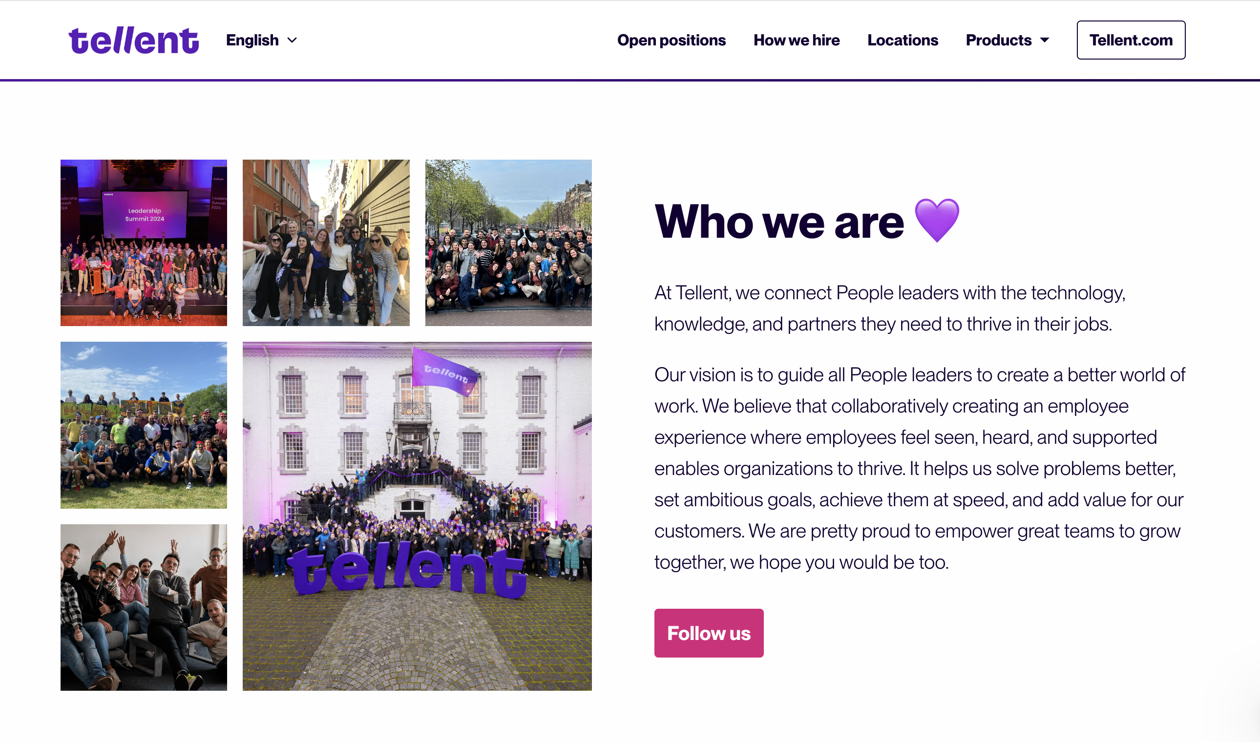
When we designed the Tellent careers page, we wanted it to do more than just list open jobs. We wanted it to tell a story about who we are and how we work together. That’s why you’ll see headlines like “Connected by community” and “Freedom to thrive.” These aren’t just slogans—they reflect our culture of collaboration, flexibility, and trust.
This is also why we’ve incorporated text, photos, and video onto the page. We want to show you what it’s like to actually work at Tellent.
One of the features we’re most proud of is the 3–6–12 month roadmap in our job descriptions. Instead of stopping at a list of tasks, we map out what success looks like in a role over the first year. We built this because we know candidates want clarity about career growth before they even apply, and it sets transparent expectations for both sides.
We also deliberated choosing to show our hiring process in four simple steps—from the first “get to know you” call to the final team meeting. By laying it all out up front, we reduce candidate anxiety and build trust. We’ve seen firsthand how this improves completion rates and keeps people engaged throughout the process.
On the practical side, we worked hard on the user experience. Roles are clearly listed with location and work model (hybrid, remote, or on-site), the navigation is simple, and candidates can log in to track their applications. All of this is designed to make the process feel seamless, especially on mobile.
Basically, our careers page is our philosophy in action. We wanted to prove that a careers page doesn’t have to be static—it can be a living, branded experience that reflects your values, sets candidates up for success, and makes applying as smooth as possible. And of course, we built it all on our own Careers Hub platform, which means anyone can do the same without needing a developer.
2. Funda
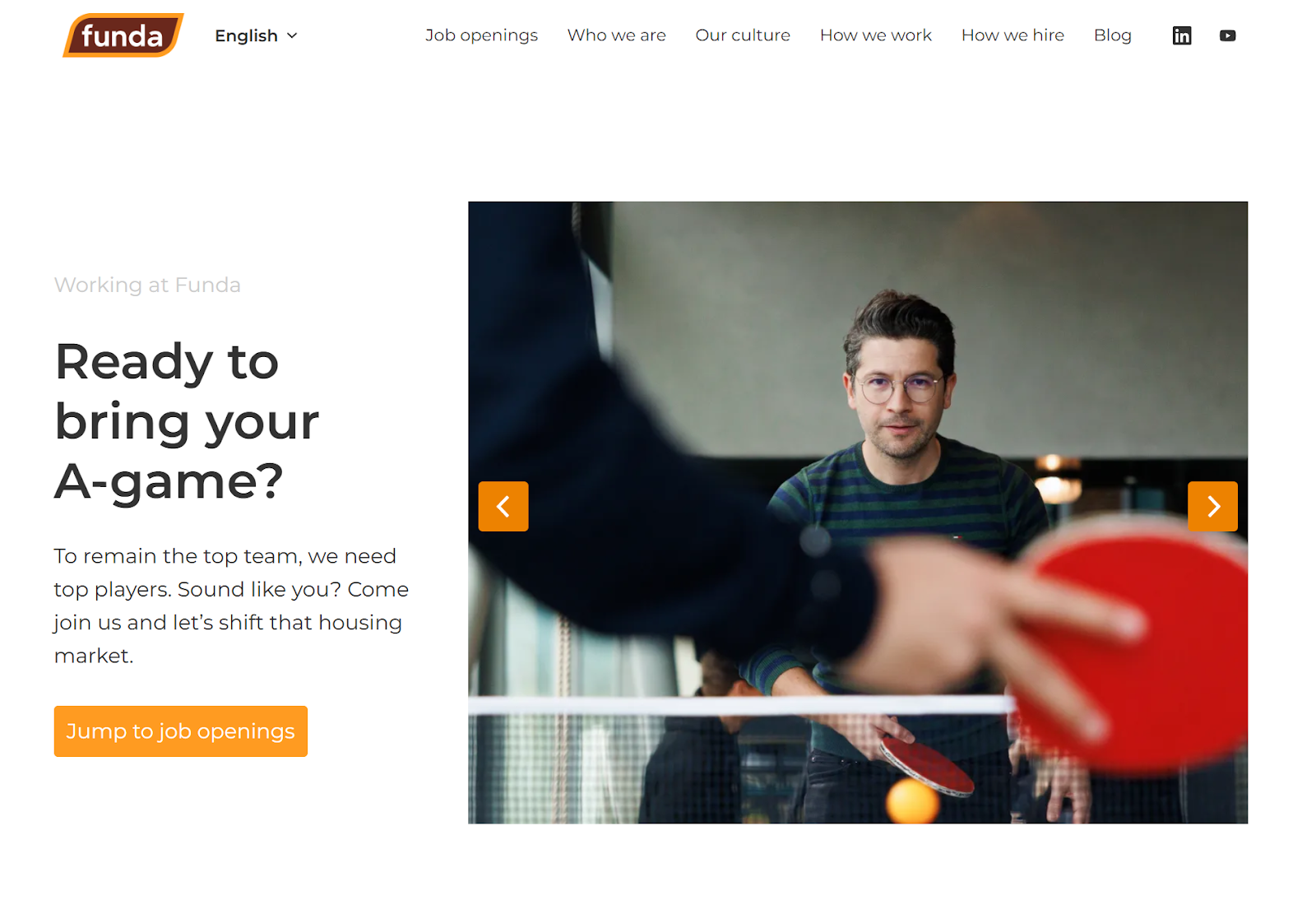
We love the simplicity and honesty of Funda’s careers page—especially the clear Employer Value Proposition (EVP) above the fold: “Ready to bring your A-game?” It immediately sets the tone, and sets a challenge for the visitor out of the gate.
What really stood out to us is their transparent “How we hire” section in their job description. They don’t just say there’s a structured hiring process—they spell it out step by step, including details like a technical assignment and an executive chat at the end. That’s the kind of openness that builds trust in candidates right away.
We know from our research in The State of Hiring report that transparency reduces drop-off and helps candidates self-select, which means higher quality applications and fewer late-stage surprises.
Here’s another clever touch. Funda gives the next step to candidates who don’t see the perfect role today. Their site encourages open applications and offers a job alert subscription so people can stay in the loop. That’s not only candidate-friendly, but it’s also a smart lead-capture mechanism for their future talent pool.
From a UX perspective, the navigation is clean and intentional. Dedicated sections like Who we are and Culture let candidates quickly explore beyond the job ads, while the “Jump to job openings” lets visitors get right down to business. And yes, the technical details matter too—Funda has structured schema data baked into the site, which gives their jobs better visibility in Google’s search results.
Overall, Funda nails it. Their careers page feels honest, human, and thoughtfully designed to make candidates feel welcome and informed from the very first click.
3. My Jewellery
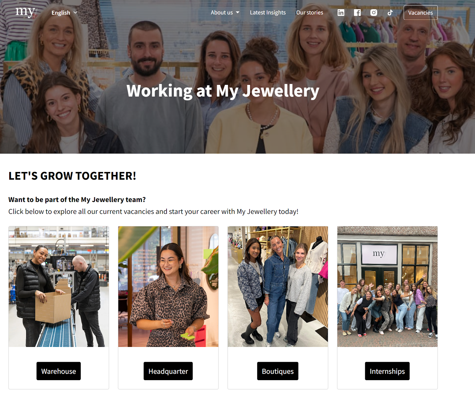
My Jewellery’s careers page gives off a welcoming vibe the second you land on the page, clearly showcasing their personality and culture from the hero section down.
Right at the top, their EVP says it all: “LET’S GROW TOGETHER!” It sets a vibrant, people-first tone and makes it clear that development and celebration are central to their brand. They even weave in a playful internal question—“What are we celebrating today?”—which instantly makes the culture feel real and inviting.
As you scroll down, you meet members of the team, including the founder, see the company in action, and are shown 4.3/5 star ratings from Indeed as social proof. This gives you an instant idea of what it might be like to work here, and who your future co-workers would be.
One of our favorite features is the navigation by department. Instead of leaving candidates to scroll endlessly through job listings, roles are neatly organized by Warehouse, Headquarter, and Boutiques. This makes it so much easier for candidates to find what matches their interests, whether they’re looking for a retail role or a corporate one.
Making it really easy to find relevant job postings is key to driving better applicant conversion rates, and My Jewellery pulls that off in spades.
Another thoughtful touch is their job alert feature and email address they provide to reach out to the recruitment team directly. This captures interest from visitors who may not be ready to apply today. Combined with their strong employer branding, it’s a smart way to keep building a warm candidate pipeline for the future.
4. Transavia
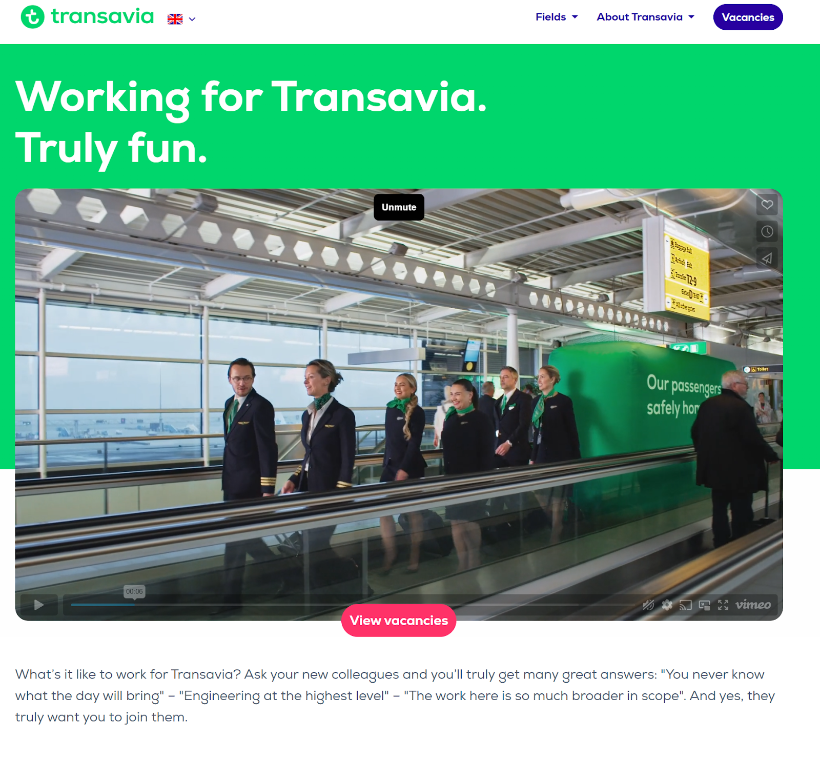
Transavia’s careers page is a masterclass in authentic brand storytelling, from their hero message to their employer video, and all the way down to their company history section.
Their EVP, “Working for Transavia. Truly fun,” sets the tone immediately—but what really makes it work is how it’s reinforced throughout the page with real employee voices. You don’t just hear about the culture from the company; you see and read stories directly from a Captain, a Certifying Technician, and others across the team. That kind of transparency makes the brand feel human and trustworthy, which is exactly what candidates are looking for.
From a usability standpoint, Transavia really thought about scale. Their robust filtering system lets candidates refine openings by department (like Cockpit or IT), city, country, and even language. For a large, diverse organization, this makes the job search experience feel manageable instead of overwhelming. Add in the bilingual toggle (English and Dutch), and it’s clear they care about making their site accessible and inclusive.
Overall, Transavia’s page shows how a big brand can feel personal. By combining authentic employee stories with a thoughtful search experience, they make candidates feel both welcome and informed.
5. Teamleader
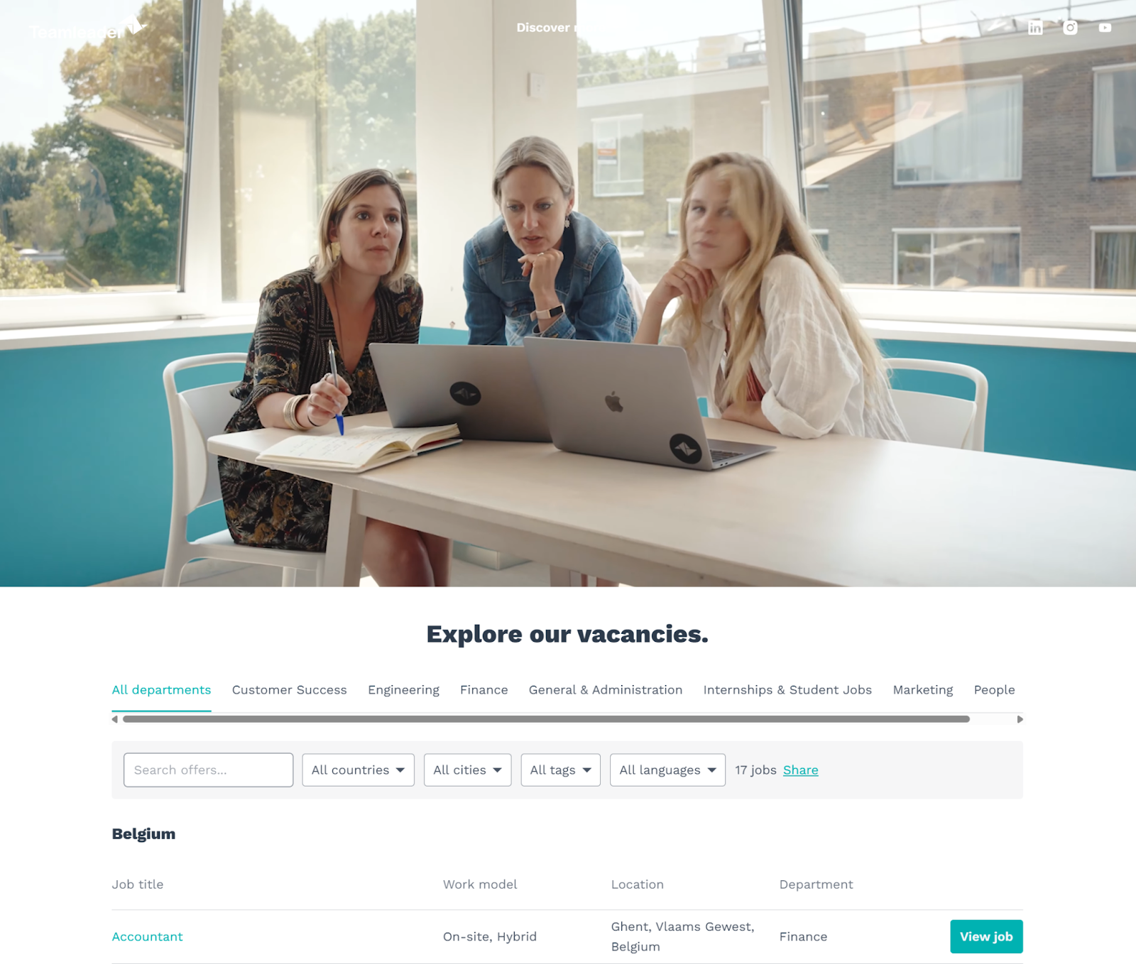
Teamleader takes a different approach to the careers pages so far, choosing to use a fun hero video to showcase their brand. Immediately below that is a robust job vacancies section, with extensive filtering by department, country, cities, and language.
They introduce you to the culture first, then provide a jumping-off point to relevant job openings. There’s extreme care taken with each job listing, ensuring that candidates can easily see the job title, work model, locations, language, and departments before they even click a link. This is self-selection at its finest and, we’d be willing to bet, significantly improves the quality of their applications.
Below all of that, Teamleader digs deeply into its company culture, social proofing, and CEO messaging to create a full picture of who this company is and what they value.
6. Xylos
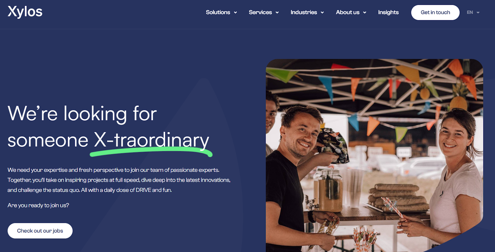
We love how Xylos takes the mystery out of applying. Their careers page leads with an EVP that’s both clever and approachable: “We’re looking for someone X-traordinary.” But what really impressed us is the level of process transparency they provide.
Instead of leaving candidates wondering what comes next, they outline the full journey step by step—from first contact, to meeting with a hiring manager, to a technical screening—with an average two-to-three-week timeline included.
That kind of openness is gold for candidates. It shows respect for their time and reduces the anxiety that often comes with job hunting.
The rest of the site reflects the same thoughtful approach. The information architecture is clean and direct, making it easy to find open jobs without unnecessary friction. The overall experience communicates that Xylos is a people-centric organization that values clarity and communication—qualities that carry straight through to how they treat candidates.
All in all, Xylos proves that sometimes the most powerful employer brand signal is simply being transparent. Their page sets the bar for how to make the hiring process feel less intimidating and more like a genuine partnership from the very beginning.
7. Conscious Hotel
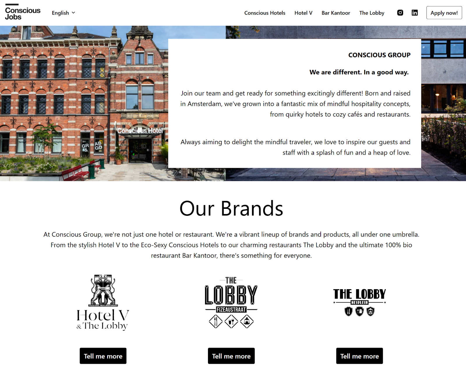
Conscious Hotel is a shining example of how a brand with multiple locations and sub-companies can use a careers page to showcase a unified culture across brands. They lead with a clear message about who they are and where they come from as a company, and then showcase their brands with jumping off links for candidates who are interested in specific locations.
They further tie their culture together as both a single entity and a group of individual locations using maps, culture statements, and sneak peeks into their expansion plans. This helps candidates understand the scope of the company they’re applying for, and their place within the larger plan.
Conscious Hotel also includes the ever-valuable hiring process breakdown, keeping it casual and friendly for all applicants.
By the time the page gets to open positions—which are filterable by location and departments—the visitor has extensive context about the company and their locations, helping them drill down to the specific venues they want to work at.
8. Zara/inditex
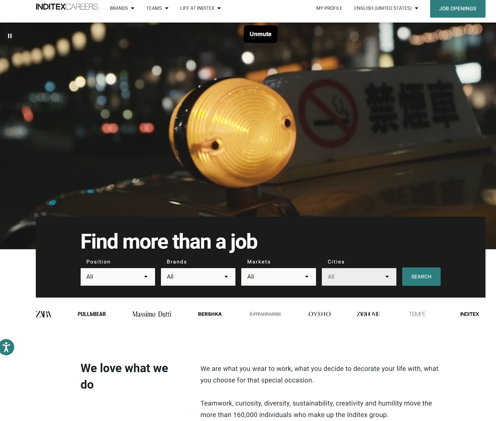
We love how Inditex (the group behind Zara and other global brands) brings their scale to life on their careers page without losing a sense of humanity. The headline “We love what we do” paired with a high-quality video immediately draws you in. You see employees not just at work but also in everyday life, which creates a powerful and authentic story about the culture behind the brand.
What’s especially smart is how they’ve broken down career paths. For a company of this size, it could easily feel overwhelming, but Inditex organizes opportunities into clear categories like Store, Technology, and Product. That structure makes the experience much more approachable, helping candidates see where they might fit in such a large organization.
We also admire how they highlight growth and learning opportunities up front. Sections on “Opportunities to grow” and “Continuous learning” speak directly to what modern candidates are looking for—development, not just a job. It’s a strong conversion driver because it answers big questions before someone even applies.
From a UX perspective, the navigation is clean, the visuals are immersive, and the overall experience feels polished. It shows that even at a massive scale, you can still create a careers page that feels personal and inspiring.
Overall, Inditex nails the balance of global reach and authentic storytelling—showing candidates that behind the world-famous brands is a culture built on curiosity, teamwork, and creativity.
9. Bunq
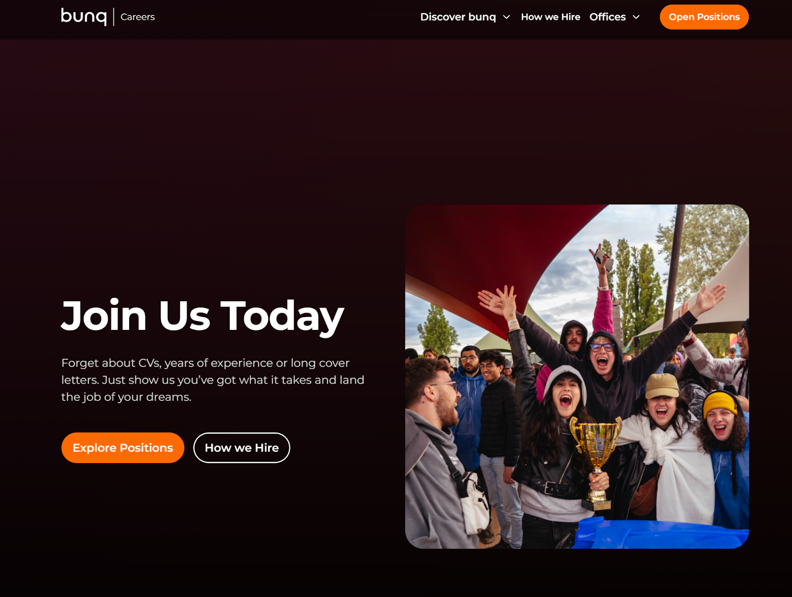
Bunq makes quite the first impression on their careers page. It doesn’t tiptoe around formality, but instead gets right to the point with this statement:
“Forget about CVs, years of experience or long cover letters. Just show us you’ve got what it takes and land the job of your dreams.” And they back that up with an even bolder “Ready to get shit done?” headline on each job description. Those are pretty clear statements about who bunq is and what they value in their candidates. Proceed accordingly, applicants!
They back up that confidence right away with a rolling logo wall of some pretty heavy-hitting brands to social proof who they are, and their standing in the industry.
The feature that really sets bunq apart is their salary transparency. Every job description includes a clear gross monthly salary range. It’s a smart move that saves everyone time—candidates self-select early, and recruiters avoid late-stage surprises or mismatched expectations.
Beyond pay, the job descriptions themselves are detailed and active. Each role outlines the mission, responsibilities, and key challenges in a way that makes the work feel tangible. Add in a scannable “Your space to perform” section covering benefits like hybrid work and learning budgets, and candidates quickly get a full picture of what’s on offer.
Overall, bunq’s careers page shows the power of being bold. By leading with a strong brand voice and pairing it with real transparency on salary and benefits, they attract candidates who are not just qualified but also aligned with the company’s no-nonsense culture.
10. HelloPrint
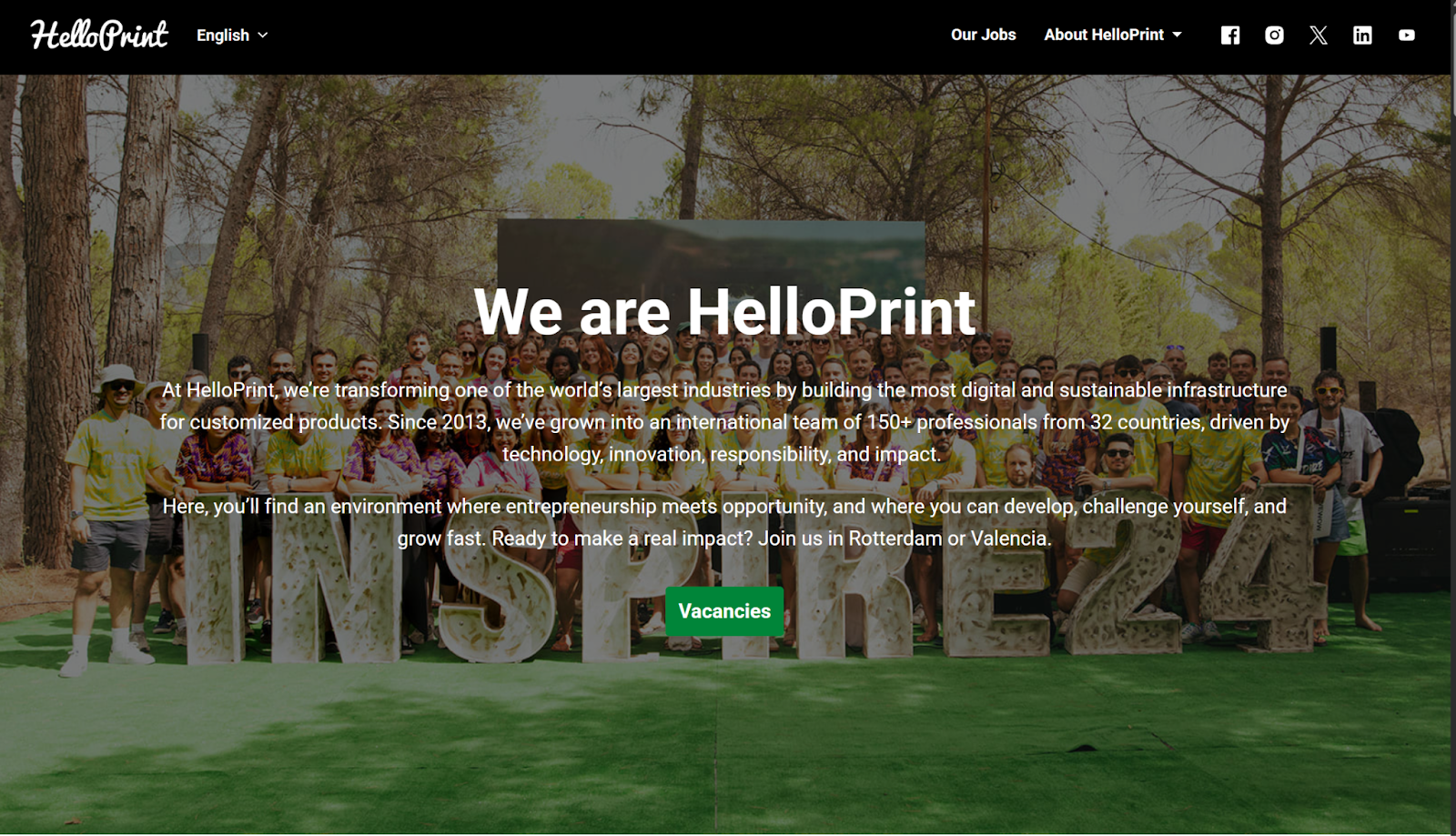
HelloPrint’s careers page is built around purpose. From the start, they highlight their B-Corp certification and mission to create a “digital and sustainable infrastructure for customized products.” That focus on impact makes the page instantly appealing to candidates who want their work to align with their values.
The page itself is clean and minimalist, which we really appreciate. The call-to-action is straightforward—“Check out the vacancies”—and the jobs are neatly segmented by location (Rotterdam and Valencia). For an international team, that’s a small but important touch that helps candidates get straight to what’s relevant for them.
We also like how the site emphasizes their entrepreneurial culture and commitment to growth. The messaging feels modern and aspirational, but never overblown. Combined with the simple design, it keeps the focus on what matters: their mission and the people they want to attract.
The complete career page checklist
Before you launch or refresh your careers page, run it against these criteria. Pages that check more than 12 of these typically outperform those that don't in both application volume and quality-of-hire.
-
Clear employer value proposition above the fold — not a generic tagline
- Real employee photos (not stock), videos, or written testimonials by name and role
- Jobs filterable by at minimum: department, location, and work model
- Work model (remote/hybrid/on-site) visible on job cards without clicking in
- A “How we hire” section with named stages and approximate timeline
- Salary ranges published on job descriptions
- Job alert or talent community sign-up for passive candidates
- Open application option for candidates who don't see a match today
- Third-party social proof (Glassdoor rating, Indeed score, awards) displayed prominently
- Mobile-optimised experience — load time under 3 seconds on mobile
- Structured schema markup on job postings (for Google for Jobs visibility)
- Benefits and perks section that goes beyond “competitive salary”
- Company mission / purpose — specific and meaningful, not generic
- DEI statement with specific data or concrete initiatives (not just a commitment)
- Careers site analytics set up to track drop-off points in the application funnel
- Candidate application tracking (ability for candidates to log in and check status)
- Brand consistency — same visual language as your product and marketing site
- Content last updated within the past 6 months (stale screenshots signal neglect)
- Direct contact for questions — email or recruiter LinkedIn profiles
- Growth / learning opportunity language — not just “what the role does” but “where it goes”
How to build your own careers page — without a developer
The pages above span large engineering teams and lean startups, but the underlying design decisions — EVP clarity, process transparency, passive candidate capture — are within reach for any company.
The main obstacle isn't design talent or budget. It's tooling. Most careers pages are either over-engineered custom builds (slow, expensive, hard to update) or under-built afterthoughts bolted onto an ATS job board (no branding, no culture, no filtering).
Tellent Recruitee's CareersHub is built specifically for this gap: a no-code platform where HR and talent teams can build a fully branded careers site with drag-and-drop builders, rich job descriptions, built-in analytics, and all the conversion features the pages above use — job alerts, open applications, structured schema markup, and 200+ HRIS integrations. Every job post is automatically structured for Google for Jobs visibility. AI-assisted job description writing creates inclusive, bias-reviewed postings faster than starting from scratch.
If you want to see it in action, the Tellent careers page itself was built on CareersHub — so you're looking at the tool's output every time you visit it.
Start for free and launch a branded careers site in under an hour. No developer required.

Tellent Recruitee Newsletter
Sign up for our newsletter and get practical hiring advice, fresh recruiting ideas, and product updates you’ll actually want to read.


